

MEMBERSHIP CAMPAIGN AND BRAND REFRESH

01
The client brief
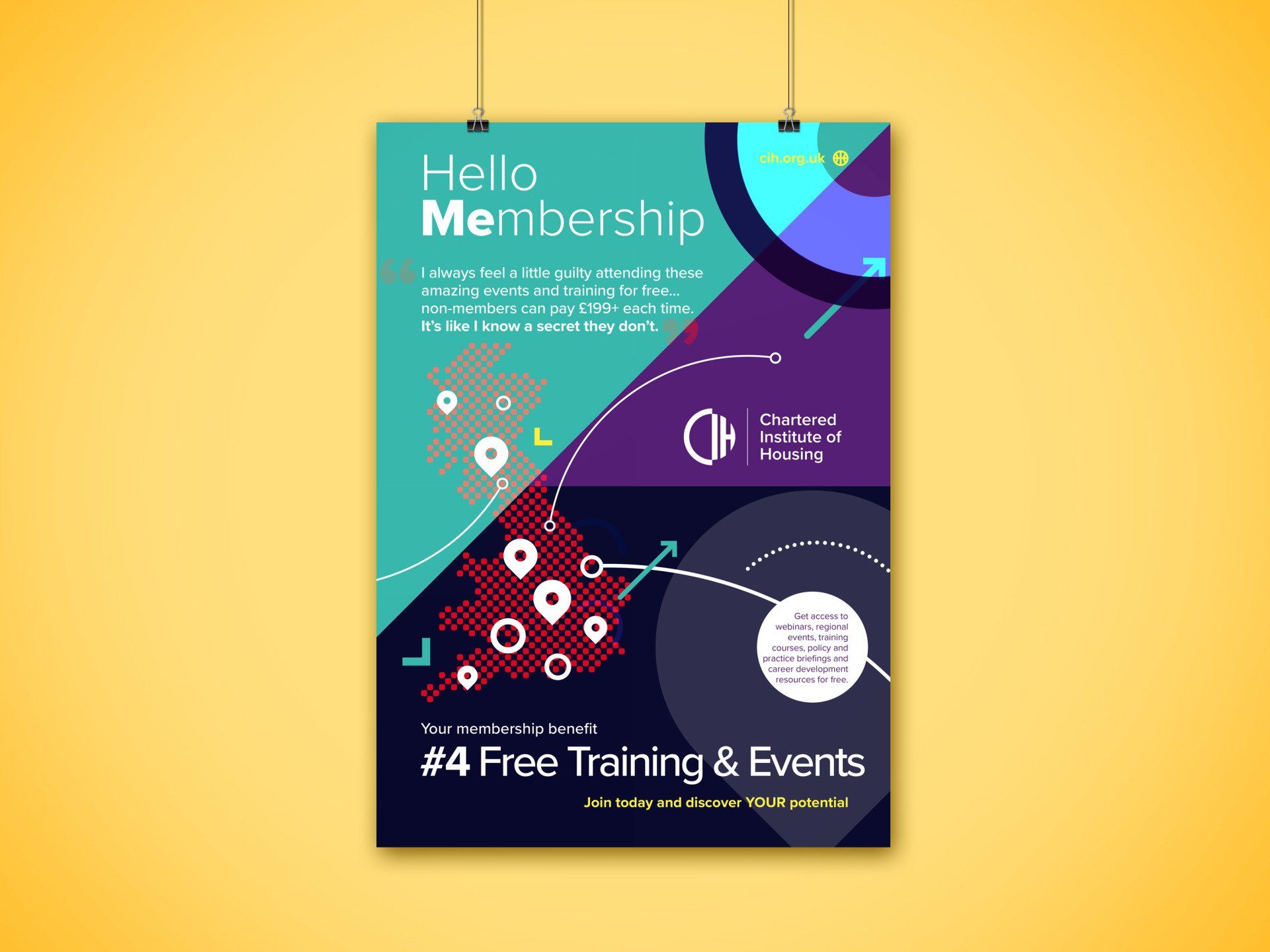
In order to boost membership and increase awareness surrounding the CIH membership offer, PO'Sh were tasked with creating a new membership campaign that would communicate the core membership benefits - an animation was chosen as a core tactic.
This campaign was to be shown online, on social media platforms and within business sectors.
02
The creative response
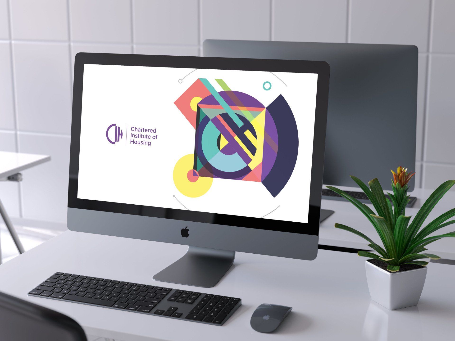
PO'Sh had just refreshed the CIH brand with a new retro-modern feel and strong brand colours - so we coupled this style with bold shapes, lines, curves and infographics to create an eye catching and informative animation showing the benefits of becoming a member of CIH. We listed and picked out key benefits that could be picked out individually or used as a bigger message.
03
The client response
I've been desperate to see this, and I'm not disappointed!! It looks great! This has gone down so well internally, we’re really excited to be rolling this out.
04
Working it out
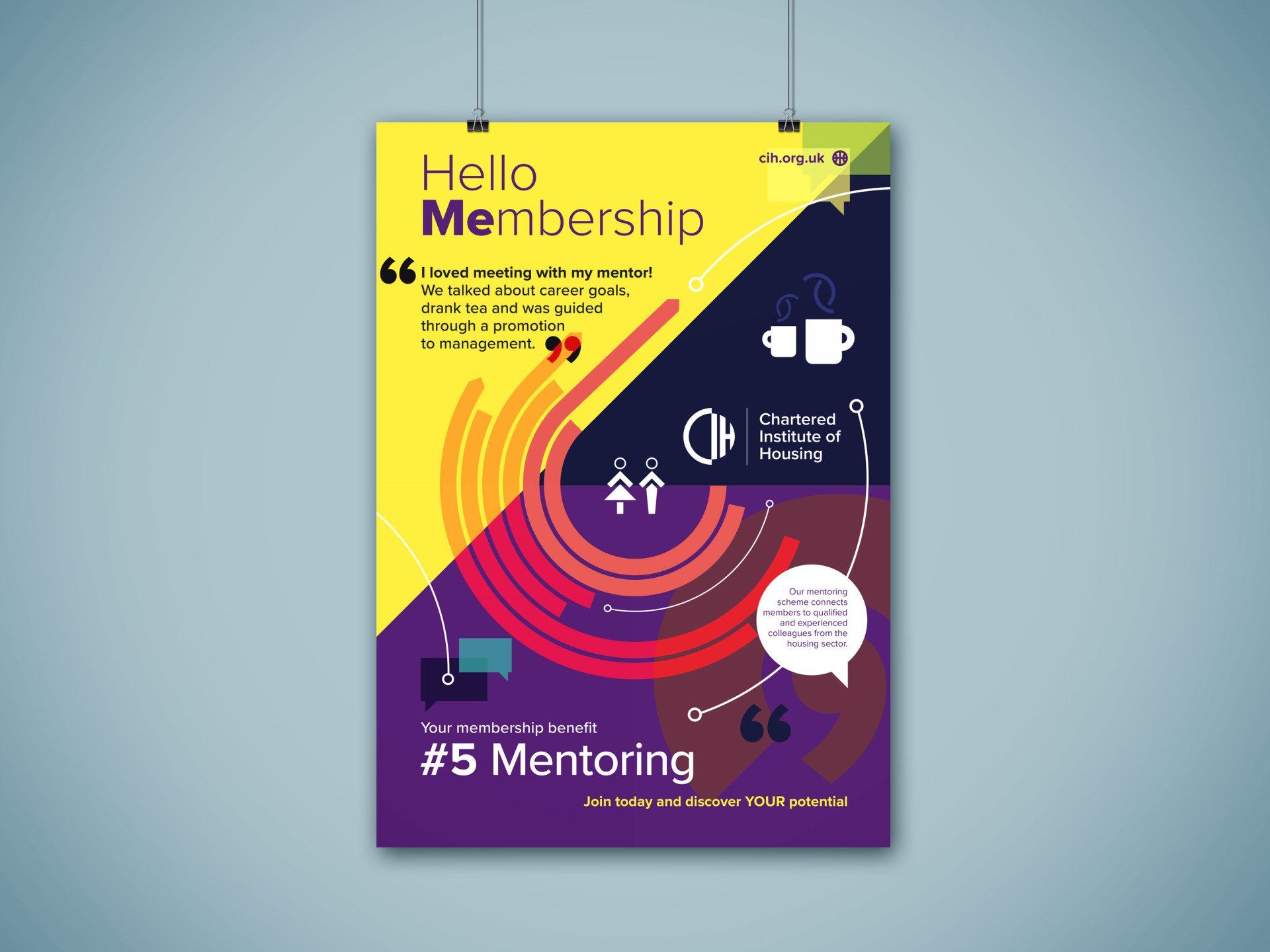
Our starting point was to make membership benefits overtly clear. So we decided on a series of short animations each communicating one key benefit that could be released over a set period as part of the wider Hello Membership Campaign. We also produced one overarching animation that encompassed all the benefits.
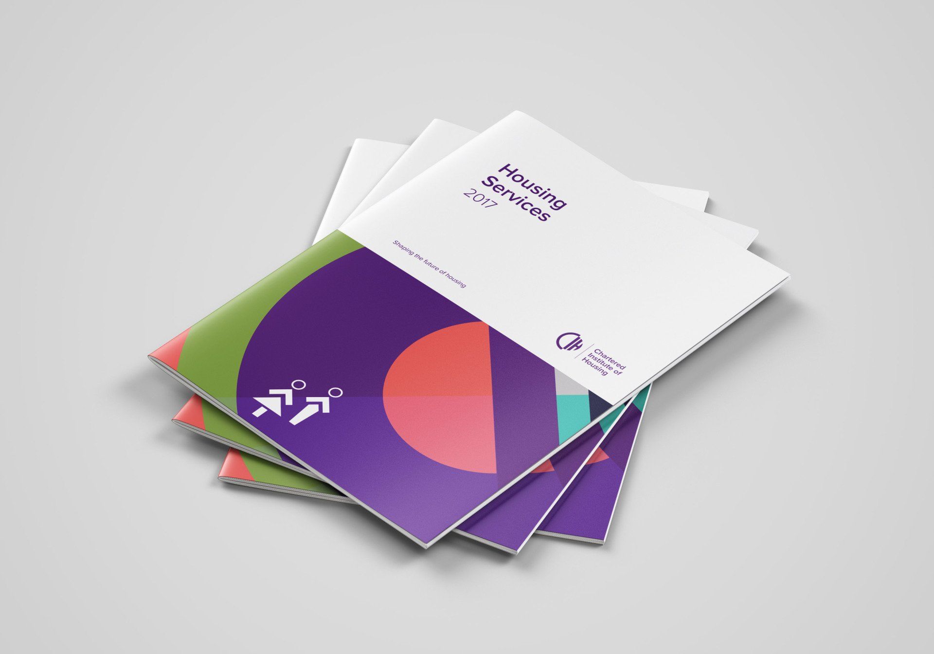
THE STYLE
Taking inspiration from the new logo and brand
elements we constructed a beautiful, kaleidoscope of colours and shapes that breathed life into our narrative. The story board was based on communicating very clearly the list of member benefits - numbered as part of the wider campaign.
The resulting style was a retro modern feel that married the heritage of CIH (born in the art deco era) and a more commercial contemporary feel. We used a chart topping style countdown to really hammer home the message 'there's a whole host of top benefits to be realised' if you became a CIH member. We used differing perspectives, speeds and shapes to really stand out and grab attention.
05
Did good things happen...
The client was very excited about the new brand that we created. It breathes new life into the company and allows for greater engagement amongst their target market. The suite of animations has now been used across various platforms to communicate their offer much more effectively.