


WEBSITE REDESIGN AND BUILD
01
The client brief
To design and develop a fully functional, clean, smart and professional website.
Mobile functionality was a major priority on this project, it needed to work to a high standard and capacity. We were asked to deliver a website which would push McCoy’s vision forward…
02
The creative response
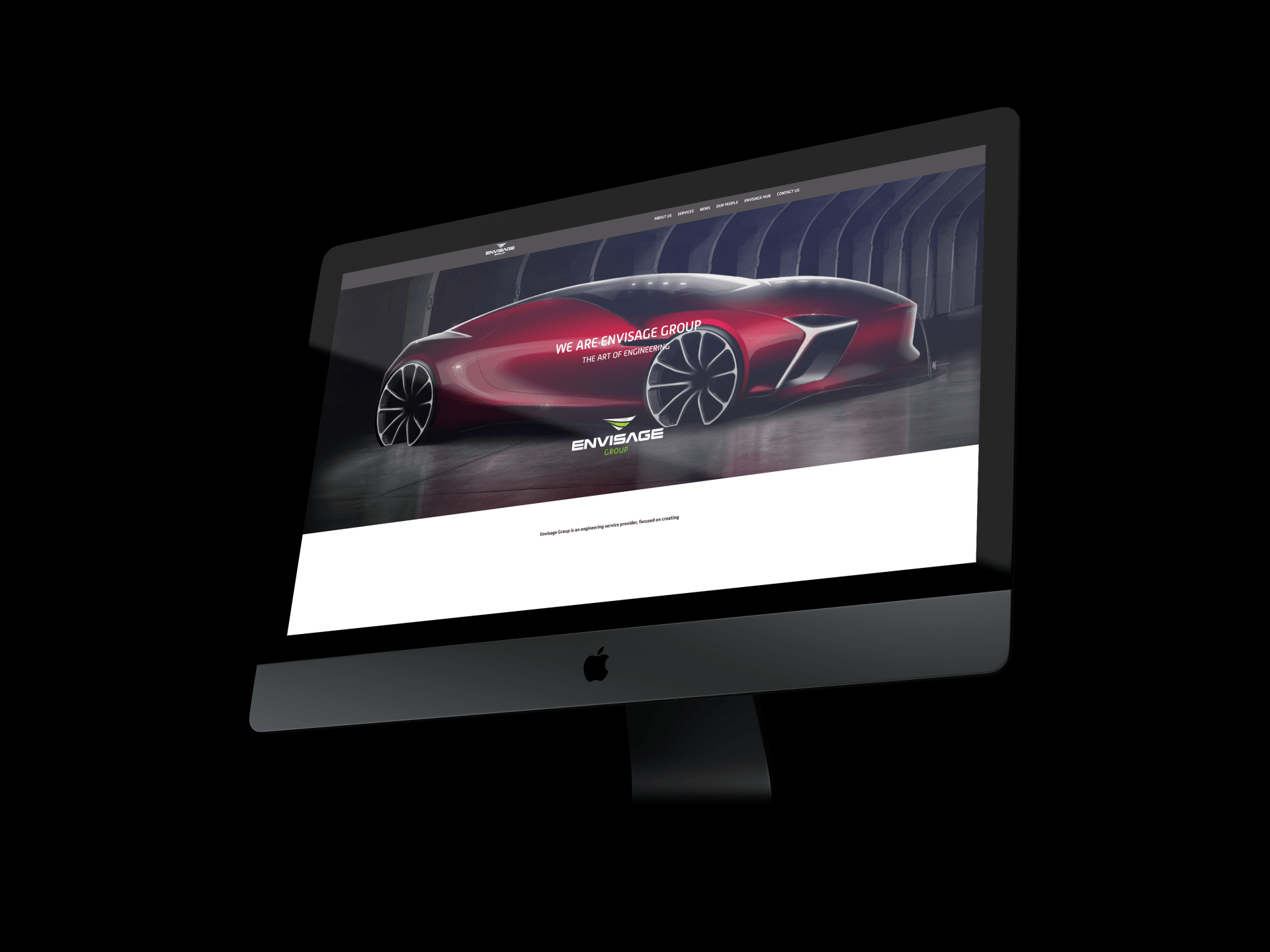
Imagery was a fundamental element to the design of this website, being able to display McCoy’s ethos, passion and positive attitude through large images and bright photography, showcasing not only their brilliant work but the highly skilled and reliable team behind the McCoy name too.
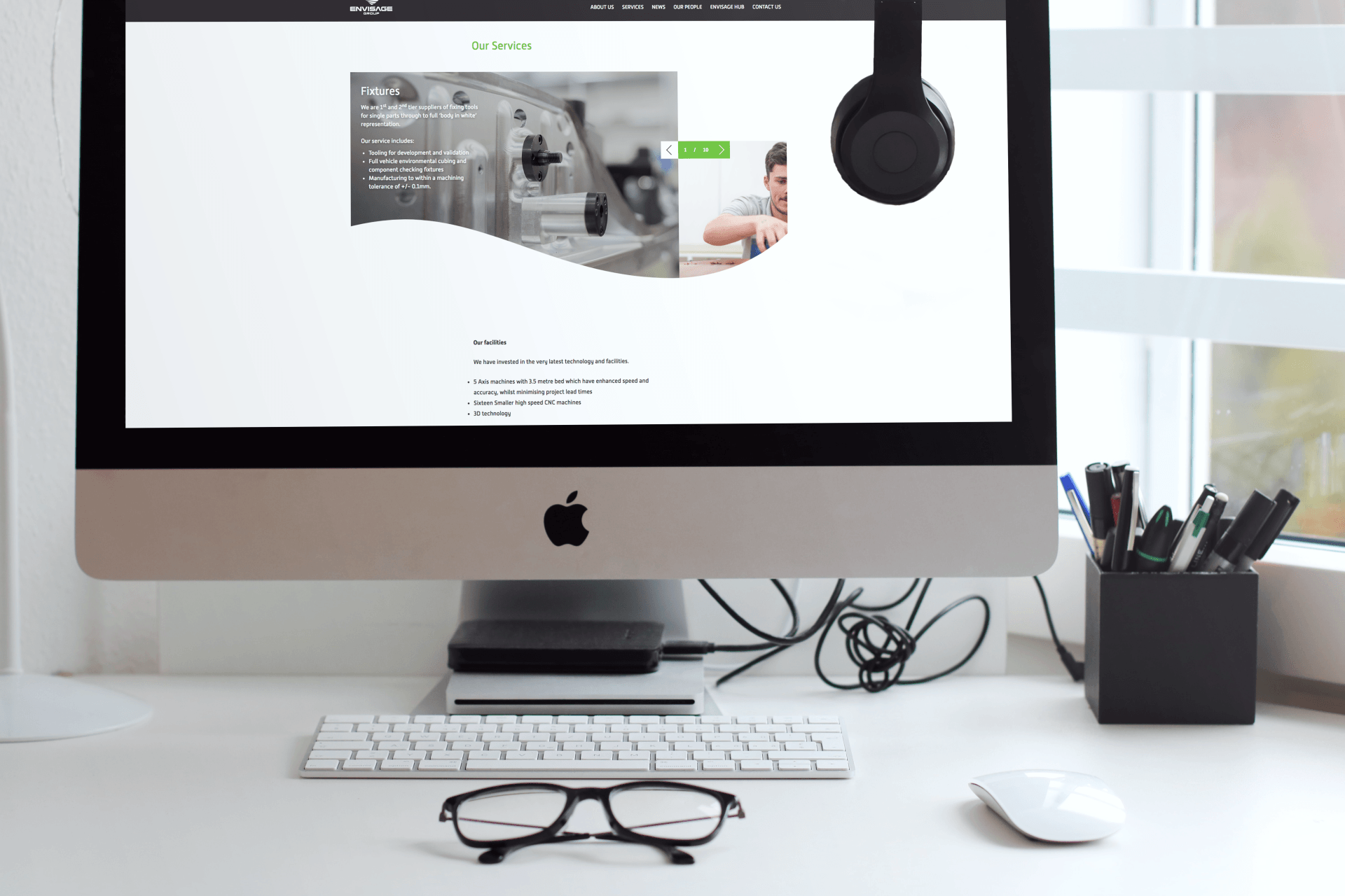
We were keen to bring the McCoy brand up to date and included much more content in the supporting pages such as their values, their approach to health and safety, current vacancies, recent newsletters, as well as a gallery of case studies.

03
The client response
McCoy Contractors

04
Working it out
As the brief for this project was a simple one, bring the website up to date and make it fresh, we couldn’t wait to give it the PO’Sh treatment.
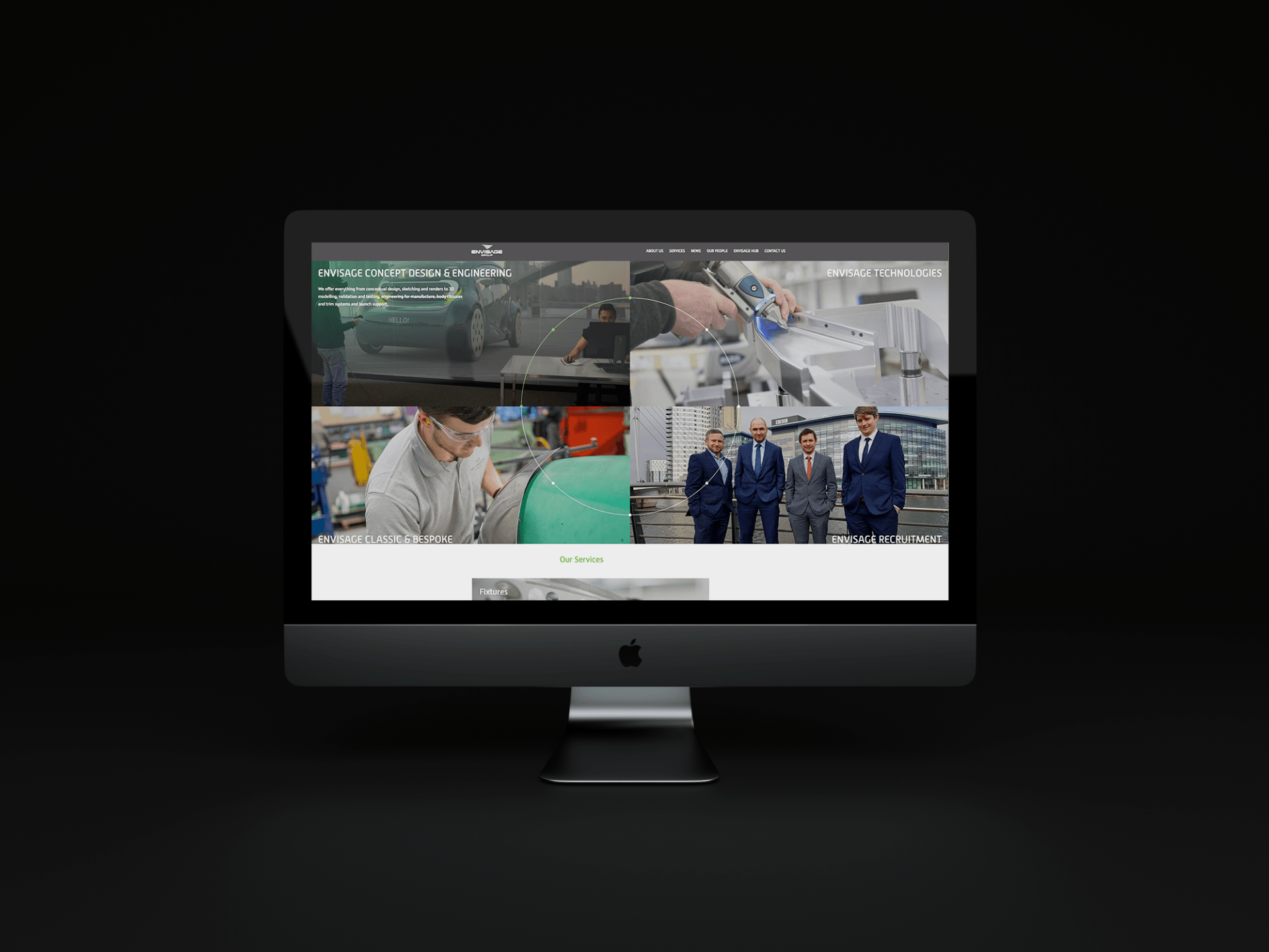
We started with the navigation, using a simple menu with click through options, and we kept the website minimal and clean.
Latest news and case studies pages were built in a blog style with a search facility too, making it really easy to use and find specific information with ease.
We kept the colour palette on brand, and we added in a contemporary brand element in the chevron icon, representing that the company are always moving forward and with safety at the forefront.
05
Did good things happen...
McCoy Contractors now have a sophisticated, contemporary website which allows them to demonstrate who they are, what they stand for and show a snapshot of the work they are hugely proud of.

Transforming brandswith creativity.
VISIT
1 Spencer Yard
Spencer Street
Leamington Spa
CV31 3NE