FINANCIAL STATEMENT
01
The client brief
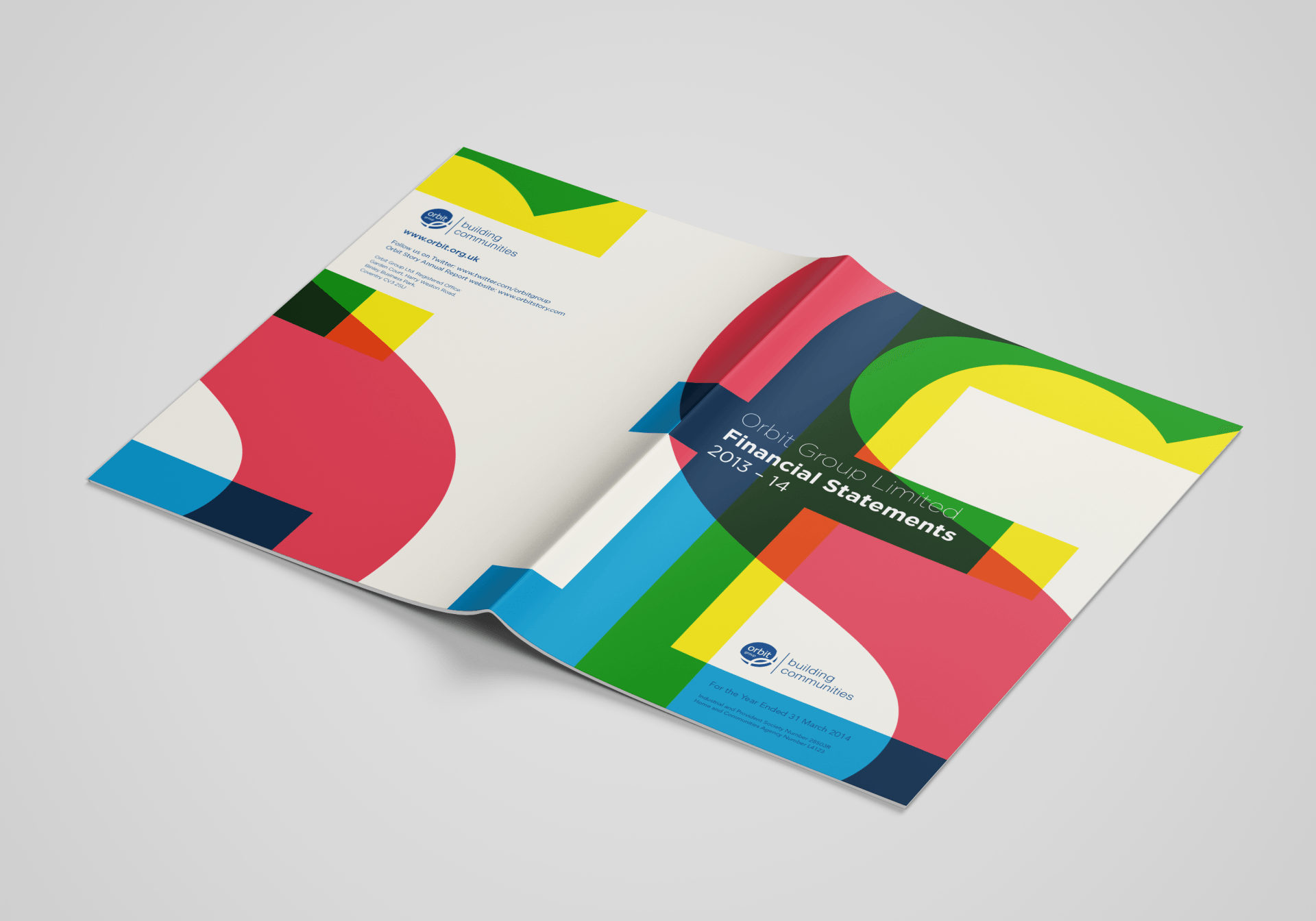
To design Orbit’s financial statement, a 100pp A4 document.
Specifically, we were challenged to bring their financial
documents to life, so that stakeholders and investors could
access key information with ease and take notice of Orbit as a
viable, forward thinking organisation.
02
The creative response
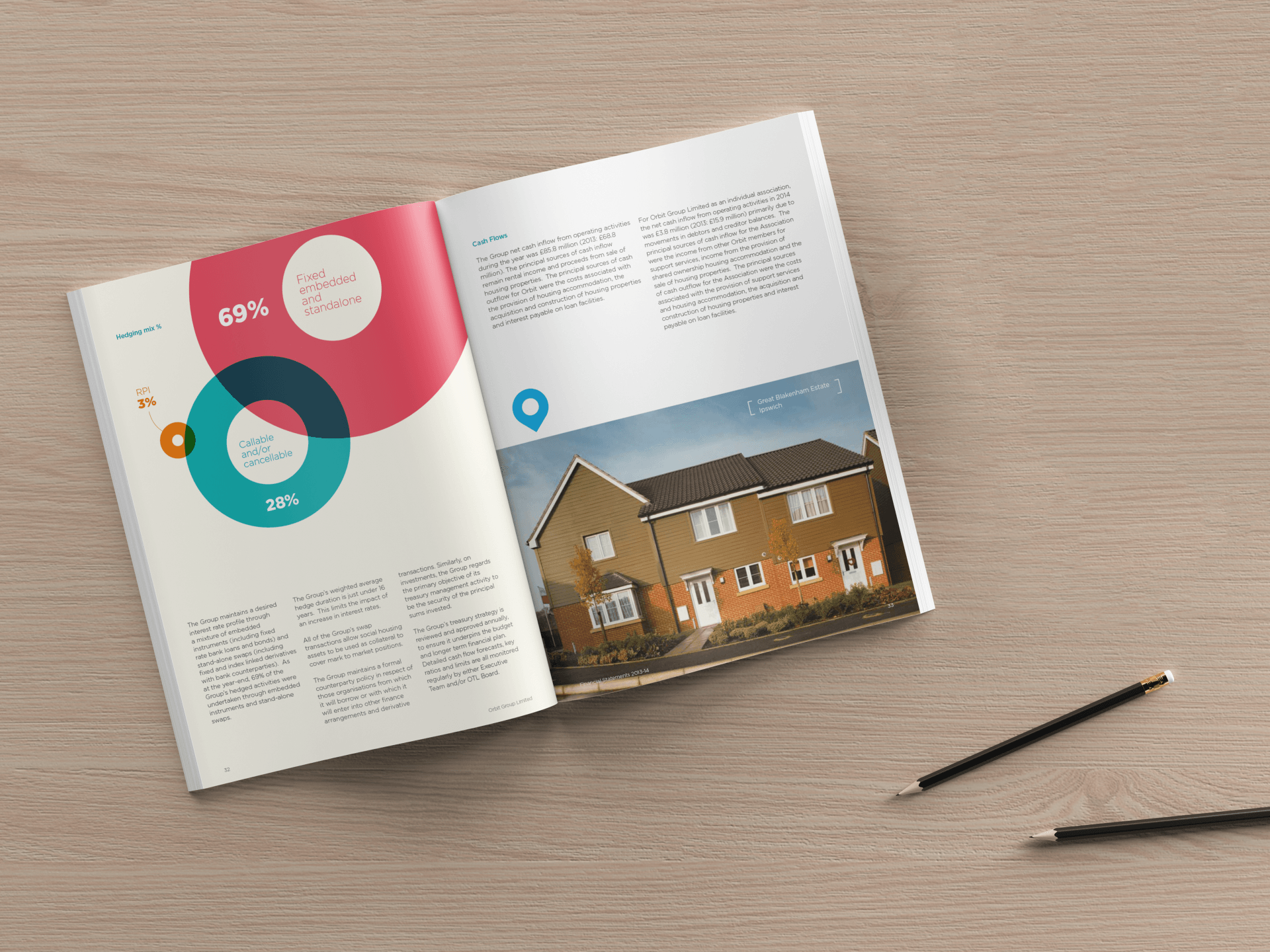
We presented an infographical approach to this brief.
Using hand drawn illustrations and symbols, we provided
an innovative and bespoke solution to displaying their data
effectively.
This style successfully enhanced the key information,
without detracting from the content or accuracy and pushed
the boundaries between creativity and practicality.
03
The client response
PO’Sh Creative’s design and marketing skills and ability to problem solve is evident – the agency has creative flair coupled with technical expertise. Their creative is innovative, considered and contextualised. PO'Sh are able to pleasantly surprise with creative solutions that fits the brief, but goes beyond what we had envisaged! They work hard to build and maintain positive working relationships with my internal customers, despite varying and challenging demands!
Amber Leahy - Orbit Group
04
Working it out
Orbit had described previous productions of the
financial statement as dry, typical of financial data and lacking in
creative input. We decided from the outset we would
produce something completely different, our starting point
was to be bold and colourful.
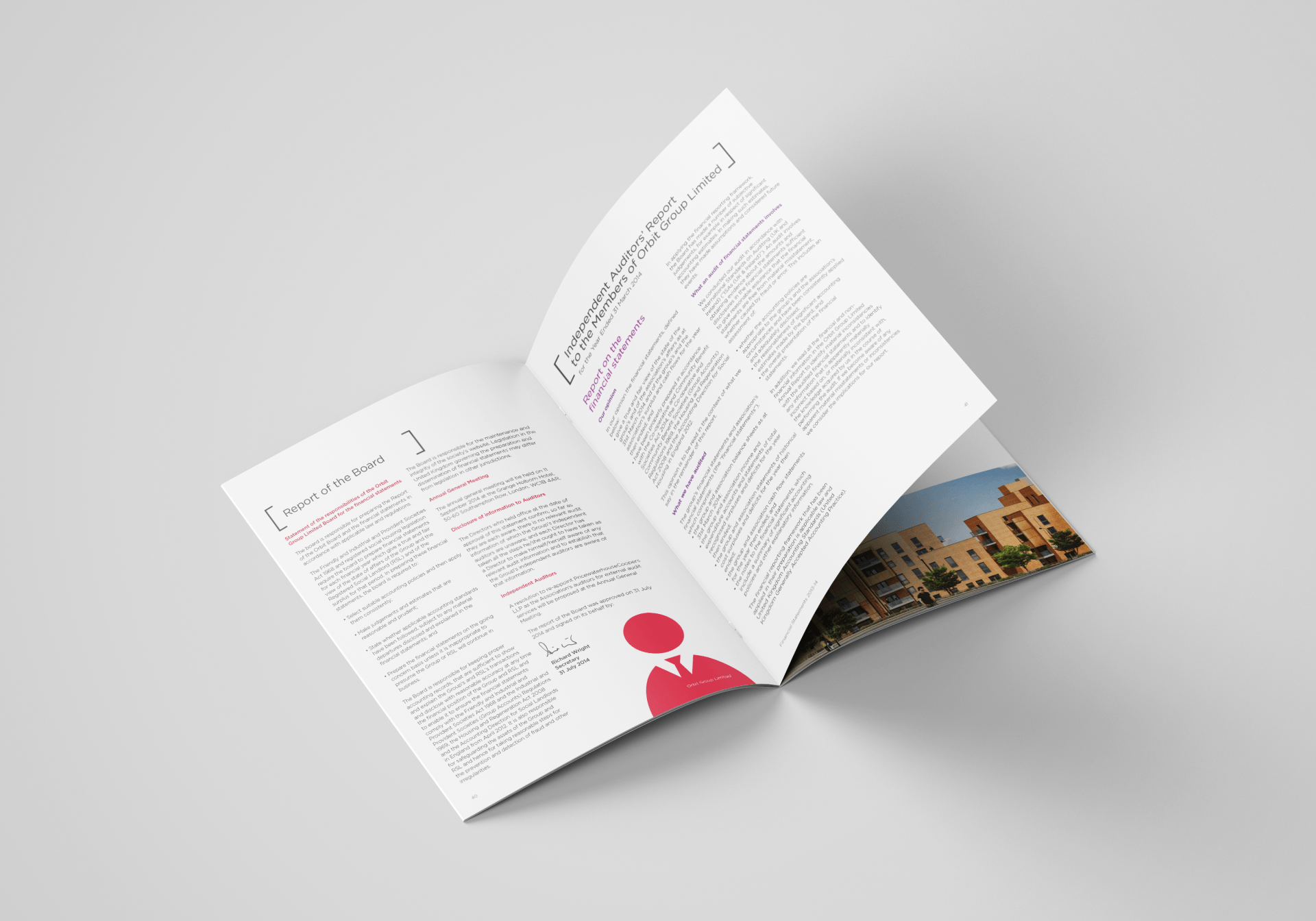
We kept the purpose of the document and Orbit’s objectives
firmly in mind, to make sure people engaged, but could also
extract information with ease, so we kept it simple and clean.
We opted for an off-white colour as the background to pages (our research suggested
this was easy to read from). We then included symbols, titles and
navigation markers to further help the reader.
We created fresh and
interesting ways to display their data, figures and statistics and added photography to bring the whole piece warmth and life; as well as display their assets and company focus on community.
05
Did good things happen...
Orbit’s financial statements were so well received by their
clients, stakeholders and customers; it was entered into the HANNA Awards, where it received Highly Commended
under the Best Board Report category.
From then on, the statements were used as a marketing tool to
enhance the Orbit brand and reflect the way Orbit are moving
forward with their creative design and corporate values.
The client team were very satisfied with the result.
We have
now been their chosen supplier for producing their financial
reports for 2015, 2016 and 2017 with relationships stronger than ever
and briefing for the 2018 statement coming shortly.
Cost?
We were able to reduce project cost here based on volume
and budget, because it was a 100 page document we
discounted our usual page rate by 35%. A significant saving.


