


BRAND CREATION & GUIDELINES
01
The client brief
Develop a comprehensive commercial brand - for a new
start-up business entering a niche and challenging
B2B marketplace.
Including: creation of company name, logo, graphic elements, brand toolkit and tone of voice.
02
The creative response
We got the ball rolling with a presentation of options on the business name, creating logo designs to match.
We held a briefing session with our client and took inspiration from their business sector and services on offer - but we also thought outside the box to give them a memorable name that had all the right connotations for their brand voice and values.
We landed on Peregrine Risk Management.
Next steps included - refining the chosen logo concept and creating a full suite of elements to compliment.
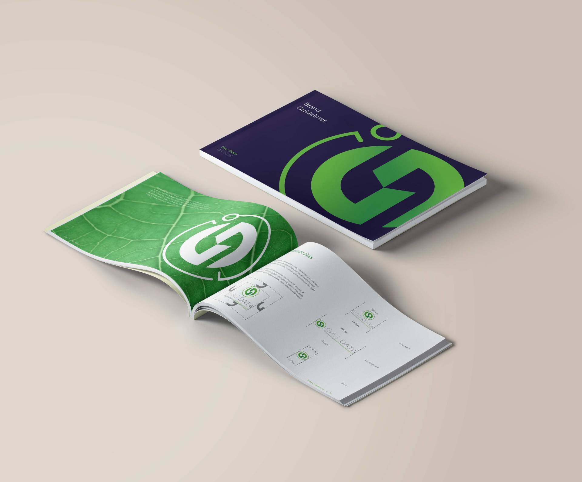
Finally, we worked up a full set of brand guidelines; introducing tone of voice, all key brand elements and instructions on correct application.
We also built and wrote the full website, in-line with the new branding, showcasing Peregrine's comprehensive service offer and their expertise.
03
The client response
PEREGRINE RISK MANAGEMENT
Working it out
THE NAME:
The business names we created all started with connections to travel, the globe, navigation and safety.
The client chose Peregrine - originally meaning foreign. It also links to Perigrination, meaning long travel. And of course, it’s the fastest animal on the planet and native to Britain. Peregrines can see things that others can’t, with great precision, at a great speed and from a great distance. Hence our name was perfectly taken from this magnificent and highly agile animal.
OUR TAGLINE
'Managing risk, anytime, anywhere'
We worked hard to add a tagline that would capture the essence of the Peregrine brand, clearly identify the business activity and position the team as the experts they are.
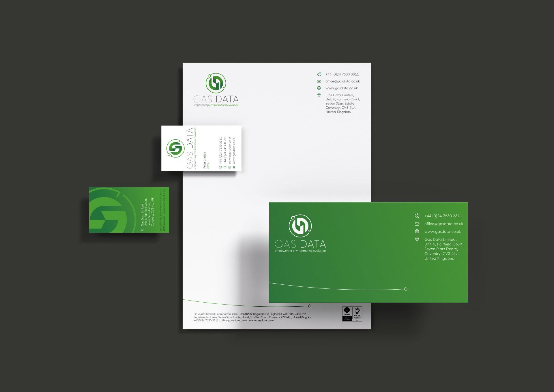
THE LOGO & BRAND ELEMENTS
This logo conveys professionalism, integrity, strength and dependability. The font is classic, yet contemporary and our choice of deep marine green was been born from the directors military background, which we off-set strikingly with a bright, and attention grabbing, aqua.
We created a ‘wing tip’ mark that was inspired by the wing of a Peregrine falcon. This stylised icon looks like it’s moving and has a dynamic shape and positive purpose.
We also created a variety of ways in which the logo can be used, including the ‘Flying P’.
05
Did good things happen...
Peregrine now has a complete, workable brand that has been a great success - allowing their company to function and present at their optimal.
The brand has a highly professional and reliable feel, whist having a bold and distinctive look - further it clearly communicates their offer.
We have also designed and built Peregrine’s website -check that out here.
Transforming brandswith creativity.
VISIT
1 Spencer Yard
Spencer Street
Leamington Spa
CV31 3NE